10 Reasons Why Your Website Design Just Doesn’t Make the Cut and How to Fix It!
Snap judgments! They’re always made in the digital world and websites are no different. Web designers, did you know that first impressions are 94% tied to desig

Snap judgments! They’re always made in the digital world and websites are no different. Web designers, did you know that first impressions are 94% tied to desig
Snap judgments! They’re always made in the digital world and websites are no different. Web designers, did you know that first impressions are 94% tied to design? And you've got a mere 50 milliseconds to nail that initial impression!?
We've all been there – you launch your shiny new website, eagerly waiting for a flood of visitors and a surge in conversions. But the reality hits hard when you realize your website design isn't quite cutting it. After all, even the best content falls flat when embedded in poor design and when website design problems crop up. What could be the reason, you ask? Well, here are 10 reasons why your website design just doesn’t make the cut and how to fit it!
1. Generic Templates That Scream "Bland!"

You know the scene: you find a template that looks "decent enough" and think it'll do the trick. Wrong move! Generic templates might save time, but they also zap away your website's uniqueness and authenticity. Here’s one of the major website design issues. Your website becomes one in a sea of look-alikes, and users won't bat an eye.
Based on web credibility research from Stanford, 75% of consumers openly admit that they judge a company's credibility based on its website design.
Ensuring your website exudes credibility starts with having a sleek, contemporary design. It's a visual testament to your company's commitment to its online presence.
Solution:
- Invest in a custom design that resonates with your brand identity.
- Tailor the visuals, colors, and layout to mirror your essence.
- Pay attention to every detail - from aspect ratios to images, fonts, and layouts.
- It's like wearing a tailored suit versus an off-the-rack one – the former screams personality and style.
2. Confusing Navigation: The Website Maze

Ever landed on a website only to feel lost in a labyrinth of links and buttons? Confusing navigation is a major buzzkill. If users can't find what they need within seconds, they're outta there! When it comes to valuable website features, a staggering 94% of people agree that easy navigation reigns supreme.
Solution:
- Streamline your navigation.
- Organize content logically and create a clear menu structure.
- Label buttons intuitively, guiding users seamlessly through your digital domain.
3. Slow Load Times: The Waiting Game

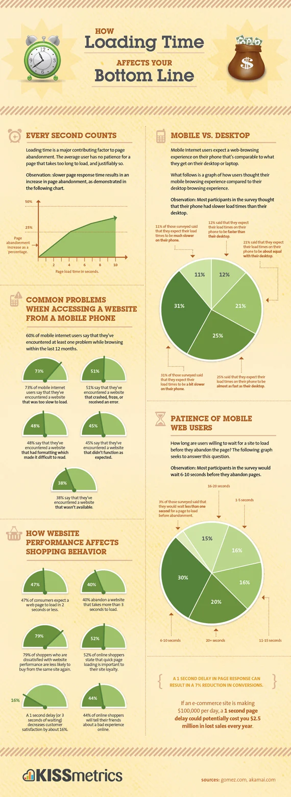
Ain't nobody got time for slow websites! If your pages take ages to load, users will bounce off quicker than you can say "refresh." Slow load times sabotage user experience and push potential customers away.
Solution:
- Focus on website loading speed optimization and optimize your website's performance.
- Compress images, minimize code, and leverage browser caching.
- Consider a Content Delivery Network (CDN) to serve content from servers closer to users, slashing load times.
4. Ignoring Mobile Optimization: The Tiny Screen Test
In the mobile-centric age, neglecting mobile optimization is a cardinal sin. If your website doesn’t come with a mobile-friendly design, you're alienating a massive chunk of users who are likely browsing on their phones or tablets.
Solution:
- Embrace responsive design to improve website design.
- Ensure your website adapts seamlessly to various screen sizes and orientations.
- Test thoroughly on different devices to guarantee a flawless user experience across the digital spectrum.
5. Lack of Engaging Content: The Yawn Zone

Picture this: stunning visuals and snazzy fonts, but the content? Dry as a desert. Engaging content for website is the heartbeat of your website. Without it, visitors won't stick around to explore what you have to offer.
Solution:
- Craft compelling, valuable, and engaging website content
- Use captivating headlines, tell stories, and provide solutions to users' problems.
- A blog with insightful articles, videos, and infographics can work wonders.
6. Cluttered Homepage Blues: Less Is More

Picture this: You land on a homepage that resembles a cluttered garage sale, where you're expected to sift through heaps of items to find what you need. Not a pleasant experience, right?
Around 84.6% of web designers are of the opinion that cluttered website design takes the top spot as the most frequent blunder committed by small businesses.
If you have a cluttered homepage, users won't stick around to explore your treasure trove of content.
Solution:
- Streamline your homepage.
- Keep it clean, organized, and uncluttered.
- Use it as a quick introduction, guiding visitors to the content they seek with clear navigation.
- There's no rule that everything must be on one page.
- Divide content into logical sections and label them for easy access.
7. Difficult to Navigate Call to Action? Make It Pop!

Ever stumbled upon a website's call to action by sheer accident? Or discovered their newsletter sign-up form deep within the labyrinth of pages? Your call to action should be like a neon sign on a dark night - impossible to miss.
Approximately 70% of small business websites miss the mark when it comes to showcasing a straightforward call-to-action.