Dark Mode vs. Light Mode: What’s a Better User Experience?
“Should I use dark mode or light mode?” The questions always comes up! While the battle between dark mode vs. light mode user interfaces rages on, what you real
“Should I use dark mode or light mode?” The questions always comes up! While the battle between dark mode vs. light mode user interfaces rages on, what you real
“Should I use dark mode or light mode?” The questions always comes up! While the battle between dark mode vs. light mode user interfaces rages on, what you really need to ask is “what's the better choice for your clients?”
Almost everyone who is designing an app’s interface in dark mode or developing dark mode emails has an opinion on this debate. Let’s check it out!
What's Dark Mode, Anyway?

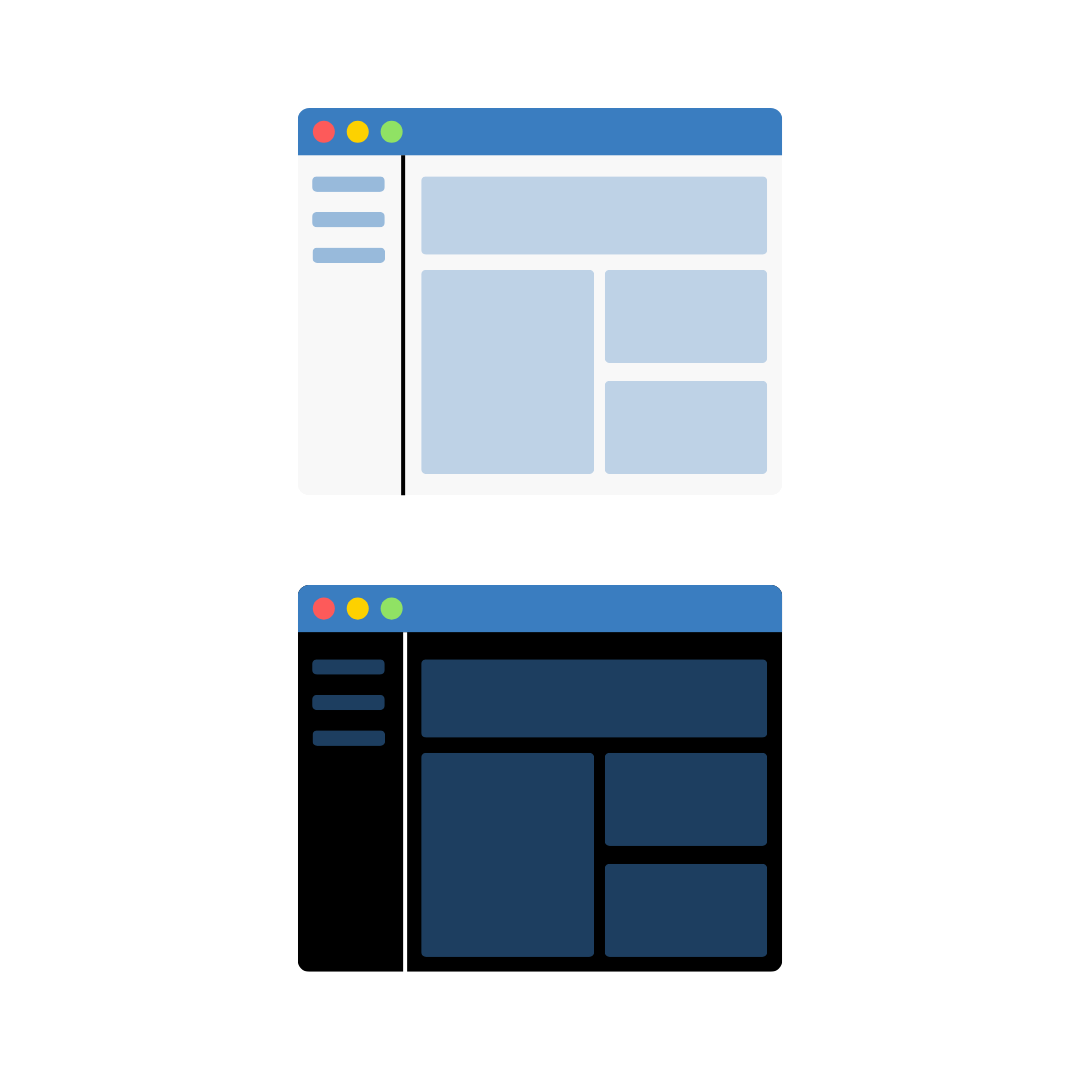
Dark mode is a sophisticated, low-luminance UI setting that decks your digital space with darker backgrounds and lighter text. Dark theme downloads have risen in popularity and are among the most sought-after options!
Approximately 79% of MacOS users embraced dark mode within a mere three months after its launch. Dark mode on iPhones led to a significant decrease of 50.18% in the time spent by iPhone users engaging with their devices.
What is dark mode used for?
- Users crave its suave appeal and the perception of reduced battery consumption, especially in mobile applications.
- Icons and text typically appear in light or vibrant colors, offering a high-contrast look.
- It reduces glare, eases eye strain, and exudes a touch of mystique.
Many designers and developers have wanted to learn the dark mode email design guide. However, it hit the mainstream with the advent of mobile and desktop operating systems offering the option to toggle between light and dark interfaces.
Let There Be Light Mode

In contrast, the light mode is all about illuminated backgrounds and darker text. It's the traditional, well-lit room of UI design.
- Its crispness and familiarity are akin to turning on the lights in a room – inviting and instantly visible.
- This mode is often praised for readability in well-lit environments. Its white or light backgrounds give an impression of cleanliness and simplicity, making it the default choice for many users.
Studies advocate for its readability and acceptance as a standard, primarily in web browsing and readability contexts.
UI Design Considerations
Accessibility and Readability

The choice between dark mode vs. light mode significantly impacts accessibility and readability.
- While dark mode is often praised for reducing eye strain, especially in low-light environments, it may not be universally accessible.
- Users with visual impairments might find light mode more suitable due to higher contrast between text and background.
- Conversely, light mode, despite its high visibility in well-lit conditions, might cause discomfort to users sensitive to brighter interfaces or those navigating digital platforms in darker surroundings.
Visual Aesthetics and User Preference

UI designers face the challenge of balancing visual aesthetics with user preference.
- The preference for dark mode or light mode often varies among users, influenced by personal taste, environment, and even cultural factors.
- Some users find dark mode's sleek and modern appearance appealing, while others prefer the crispness and familiarity of light mode.
Consistency and Brand Identity

Maintaining a consistent user experience across applications and platforms is crucial for brand identity. Check out brand identity examples and also pay attention to:
- Design choices, including the selection of dark mode or light mode, should align with a brand's aesthetics and identity.
- Striking a balance between an appealing visual interface and brand consistency as it is a key consideration for UI designers and development teams.
Impact on User Experience
User experience UX is equally vital when choosing between dark mode and light mode.

Eye Strain and Comfort

The choice between dark mode and light mode significantly influences user comfort, eye strain and head pressure.
- Dark mode, with its lower luminance and reduced blue light emission, tends to cause less eye fatigue in low-light conditions.
- This mode is favored by users spending extended periods on digital devices, especially during nighttime usage.
- Conversely, light mode provides higher contrast and readability in well-lit environments.
- Users who prefer a more traditional interface or are sensitive to dark backgrounds may find light mode more comfortable.
Battery Consumption and Device Efficiency

Dark mode or light mode better for battery? Another aspect influencing user experience is the impact on device efficiency.
- It's generally believed that dark mode consumes less battery power, especially on OLED screens, due to fewer pixels being illuminated.
- This could potentially extend battery life for devices with OLED displays when using dark mode.
- Conversely, light mode might consume more power due to increased screen brightness, particularly in devices equipped with LCD screens.
While the difference may not be stark in practical terms, it's a consideration for users concerned about device efficiency.
Readability and Visibility in Various Environments

- Readability design and visibility are pivotal elements of user experience affected by the chosen mode so understand what is a good visibility distance.
- Dark mode excels in low-light environments by reducing glare and improving text readability, making it an excellent choice for users in dimly lit or nighttime settings.
- Conversely, light mode provides clear visibility in well-lit surroundings, enhancing readability and reducing strain on the eyes in such conditions.