How to Embrace Color Accessibility: Inclusive Design Strategies that Work!
A lot has been said about accessible design, but ever looked at color accessibility? After all, colors impact our daily lives and have the potential to evoke em
A lot has been said about accessible design, but ever looked at color accessibility? After all, colors impact our daily lives and have the potential to evoke em
A lot has been said about accessible design, but ever looked at color accessibility? After all, colors impact our daily lives and have the potential to evoke emotions and sensations in various contexts.
It’s not just about using aesthetically pleasing colors or a feature that is “nice to have”. You may think you have a good contrast of colors planned for your site, but then, if people perceive these colors differently, it can make interfaces incredibly difficult to use. That’s where color accessibility: strategies for inclusive design come into play. It's about taking a fresh look at the way we engage with a diverse range of users to craft accessible and inclusive designs for everyone. In this blog, we will explore the essential principles that guide UX Designers in creating designs that are inclusive and easy to use for everyone. Are you ready to ensure every user has an enjoyable and smooth digital journey? Let's get started.
What is Color Accessibility?

Color accessibility is more than just a design consideration; it’s a fundamental aspect of creating an inclusive digital experience. When we talk about color accessibility, we’re addressing the ability of all users—regardless of visual abilities—to perceive and interact with content effectively. This encompasses the thoughtful use of a color accessibility palette and having a n inclusive design strategy in place to ensure that information is not conveyed solely by color, allowing those with color vision deficiencies to equally access the digital medium. But why is color accessibility so crucial?
Why Bother about Color Accessibility?
When designing digital products for a diverse audience, color choice is crucial. Know the best color combinations for accessibility and keep brand identity design in mind.
Colors:
- Communicate your brand identity
- Convey information
- Shape the user experience.
However, not everyone perceives colors the same way.
Some users may be color blind, visually impaired, or accessing your product in different lighting conditions. This is why accessibility must be a top priority when incorporating colors into your designs.
By making inclusive color choices, you ensure that your digital products are usable and enjoyable for all users, regardless of their visual abilities or environmental factors.
When considering color accessibility, one must acknowledge the varying degrees of how people perceive color. From total color blindness to the more common deuteranomaly, or red-green color deficiency, the spectrum is wide and considerably common. It's estimated that color vision deficiency affects approximately 1 in 12 men and 1 in 200 women globally. Thus, overlooking this aspect means failing a sizable number of the potential audience.
Prioritize Contrast Grading Criteria
It’s crucial to priortize accessibility color contrast guidelines. Contrast and color choices in design helps to guide users, influence moods and emotions and often dictate the usability of a product. Recognizing the colors and their contrast are often taken for granted by those with typical vision, but for others, this poses a real challenge.
Let's simplify contrast standards. Think of contrast levels like medals: 'A', 'AA', and 'AAA'. The 'AAA' level is the ultimate goal for making your content accessible.
To meet the W3C standards, aim for at least 'AA' contrast. This applies whether you're checking text on buttons, ensuring readable backgrounds, or making navigation bars clear. The evaluation comes in two sizes: regular and large. Regular is your standard text size, around 16px. Large text is either bold and 18px or regular but bigger at 24px. Let's aim high to create designs that everyone can see clearly.
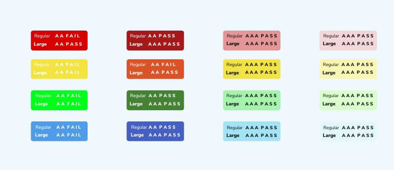
An inclusive design acknowledges these differences, ensuring that information conveyed through color is also presented in other forms, like text labels or patterns.
You should know that achieving accessibility starts with a clear set of criteria, which you can find in the WCAG 2.1 guidelines. These guidelines are your roadmap to creating experiences everyone can use.
The Best Color Combinations for Accessibility
Let's focus on color choices that are friendly for those with color vision deficiencies (CVD). People with normal vision can detect all three primary colors of light: red, green, and blue. But for those with a CVD, colors can blend. They come in four main types:
- Protanopia makes red shades less vibrant.
- Deuteranopia dims green hues.
- Tritanopia lessens the intensity of blue.
- Achromatopsia affects the perception of all three colors.
For an inclusive design, steer clear of these color pairings that can be problematic for people with CVD:
- Red with Green
- Light Green with Yellow
- Blue with Purple
- Blue with Grey
- Green with Grey
- Green with Blue
- Green with Brown
- Green with Black
By choosing colors wisely, we can create a better experience for everyone.
Ensure Visibility with Contrast Tools
Leverage resources like WebAIM's Contrast Checker to make sure your text and key visuals pop against their backgrounds.
Steer Clear of Color-Only Cues
Always pair color with other identifiers (like text or patterns) to guarantee that color-blind users can access the information.
Test for Color Accessibility
Frequently use color-blindness simulators to check that your designs stay clear and distinguishable to users with various color vision challenges.
Take Note
To achieve inclusivity and accessibility in your color choices, remember these two key points:
- Never rely solely on color to communicate information or actions.
- Always maintain a strong contrast between elements in the foreground, like text or icons (including form borders and other elements), and their backgrounds.
Following these guidelines ensures that everyone can navigate and understand your content with ease.
Make Navigation Keyboard-Friendly

Keep in mind, that not all users can wield a mouse. To include them:
Check Your Interfaces: Frequently test to confirm that every part of your design works with keyboard shortcuts. Think about menus, forms, and anything users interact with.
Intuitive Tab Sequence: Arrange your site or app so that tabbing through it makes sense. It should be naturally easy for keyboard users to get around.
Highlight Focus Points: Use noticeable visual signs to track keyboard navigation—for example, buttons or menus that light.
Ensure Interactive Elements Work for Everyone